This is the basic building block of matter that creates the world of chemical elements – although it is made up of more fundamental particles.

The cover art of the recently launched Quantum Shorts e-book is the work of Syafiqah, a multidisciplinary graphic designer and illustrator based in Singapore. Besides designing the book’s cover, Syafiqah also prepared the layout you see in the PDF version of the e-book.
We spoke to Syafiqah about designing for the Quantum Shorts e-book.
What do you hope for people to feel when they see the cover?
To not be afraid upon seeing the words “quantum physics”. You will definitely not find the textbook kind of stuff in the book. The stories in here have wonderful pacing, tones and perspectives.
Please tell us about yourself and your design style.
I’m someone who values symbols, metaphors and hidden meanings. I’m also interested in giving voices to universal human emotions in order to touch people on a profound level.
Who are your favourite designers or what are your favourite works?
Hmmm, would it be weird to say that I don’t have any? I really do look up to and enjoy everyone’s works. I’ll spend countless hours going through sites such as itsnicethat.com, behance or just design studios and illustrators that I follow on Instagram. I feel like there’s so much that you can learn and take inspiration from people who enjoy doing the same things as you do.
Why did this project appeal to you?
I have always found quantum physics to be intimidating having only done physics back in secondary school. My only encounters with quantum physics were through films like Spiderman: Into the Spider-Verse! Reading these short stories has definitely helped me improve my understanding of quantum physics through the imagination and words of these writers.
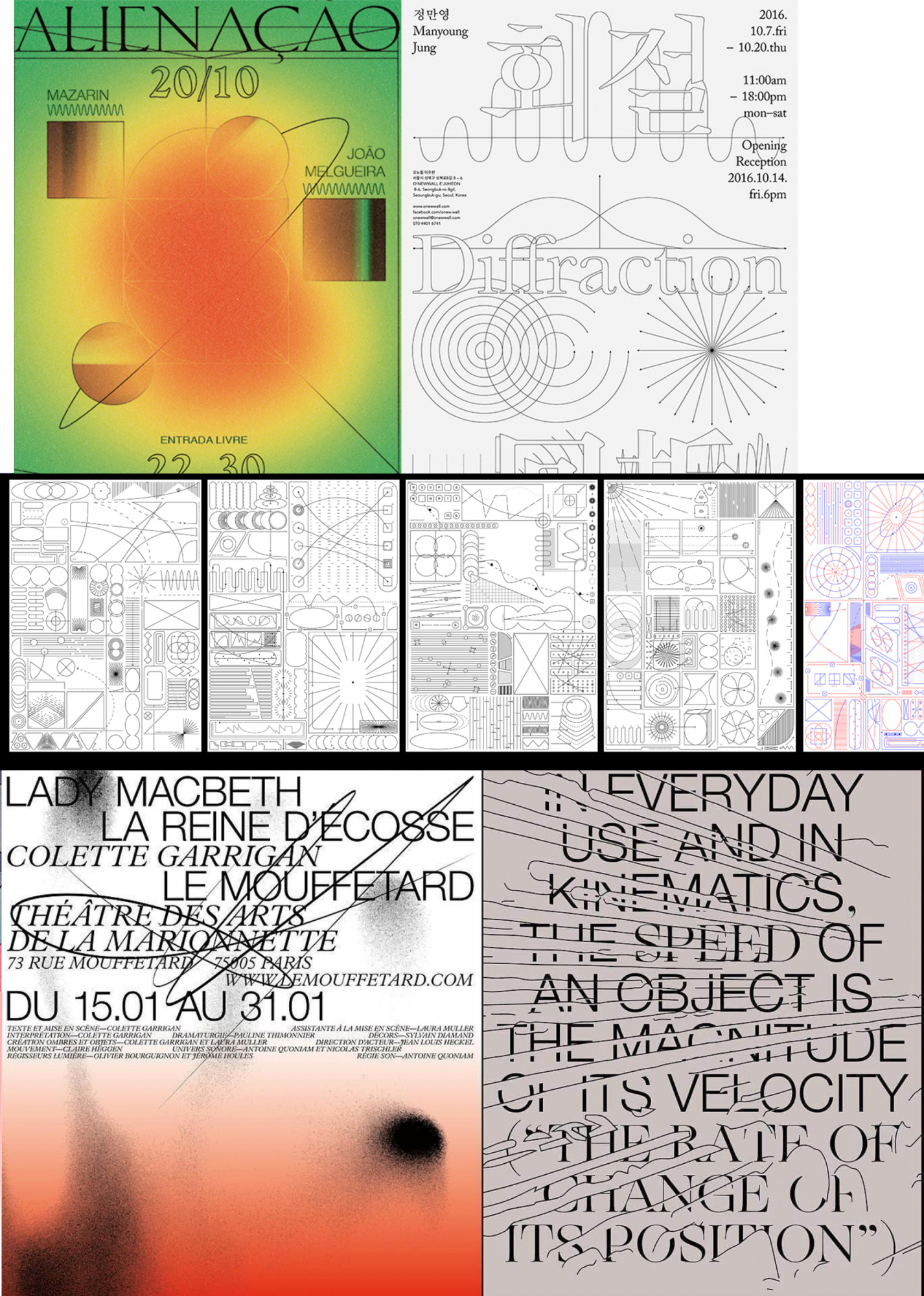
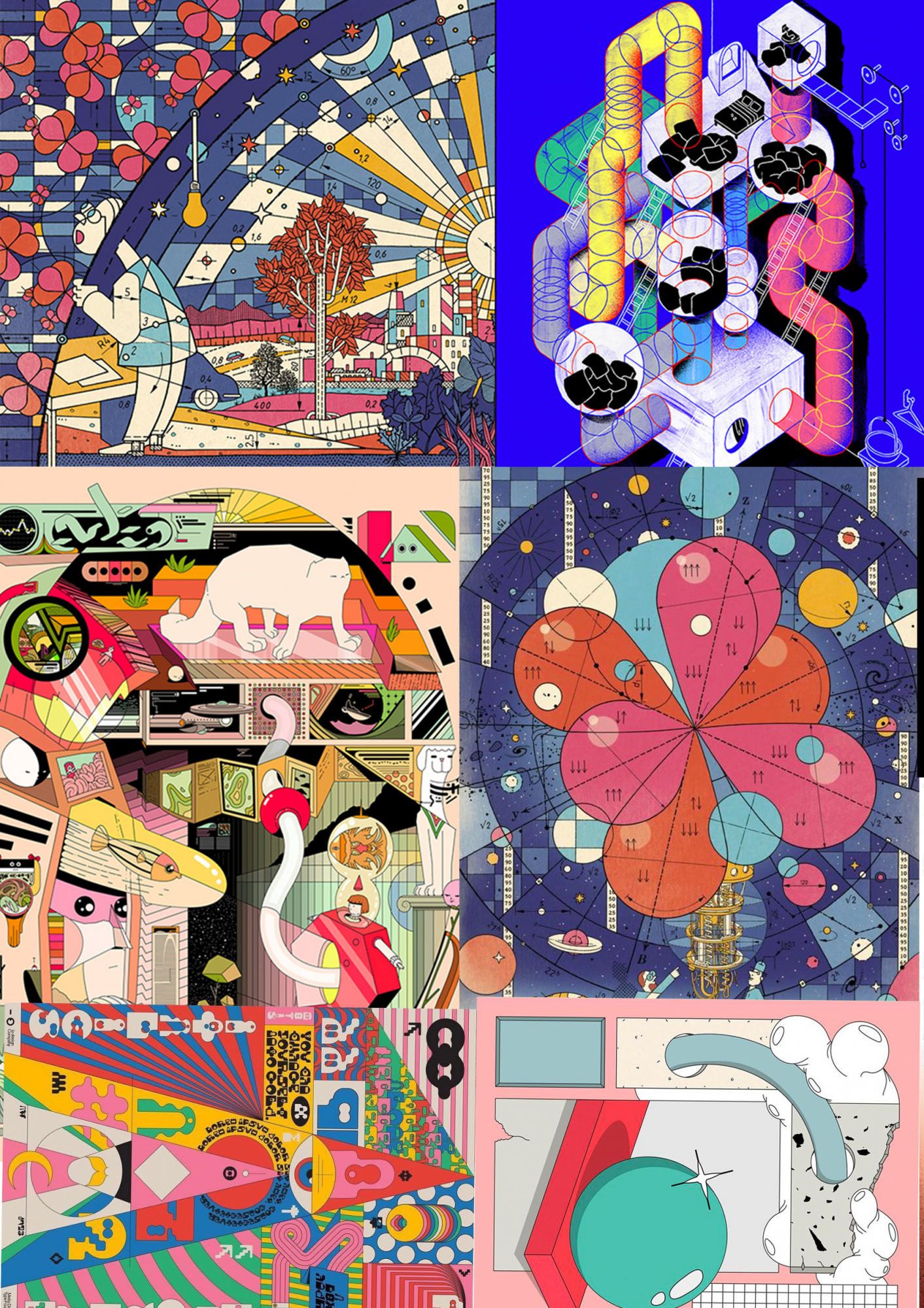
The two different moodboards that Syafiqah referenced before designing the cover of the Quantum Shorts book.
What is the process like designing a book about stories inspired by quantum physics?
To find the perfect balance when it comes to combining elements of visualisation from both parts of the book—the fiction and the science.
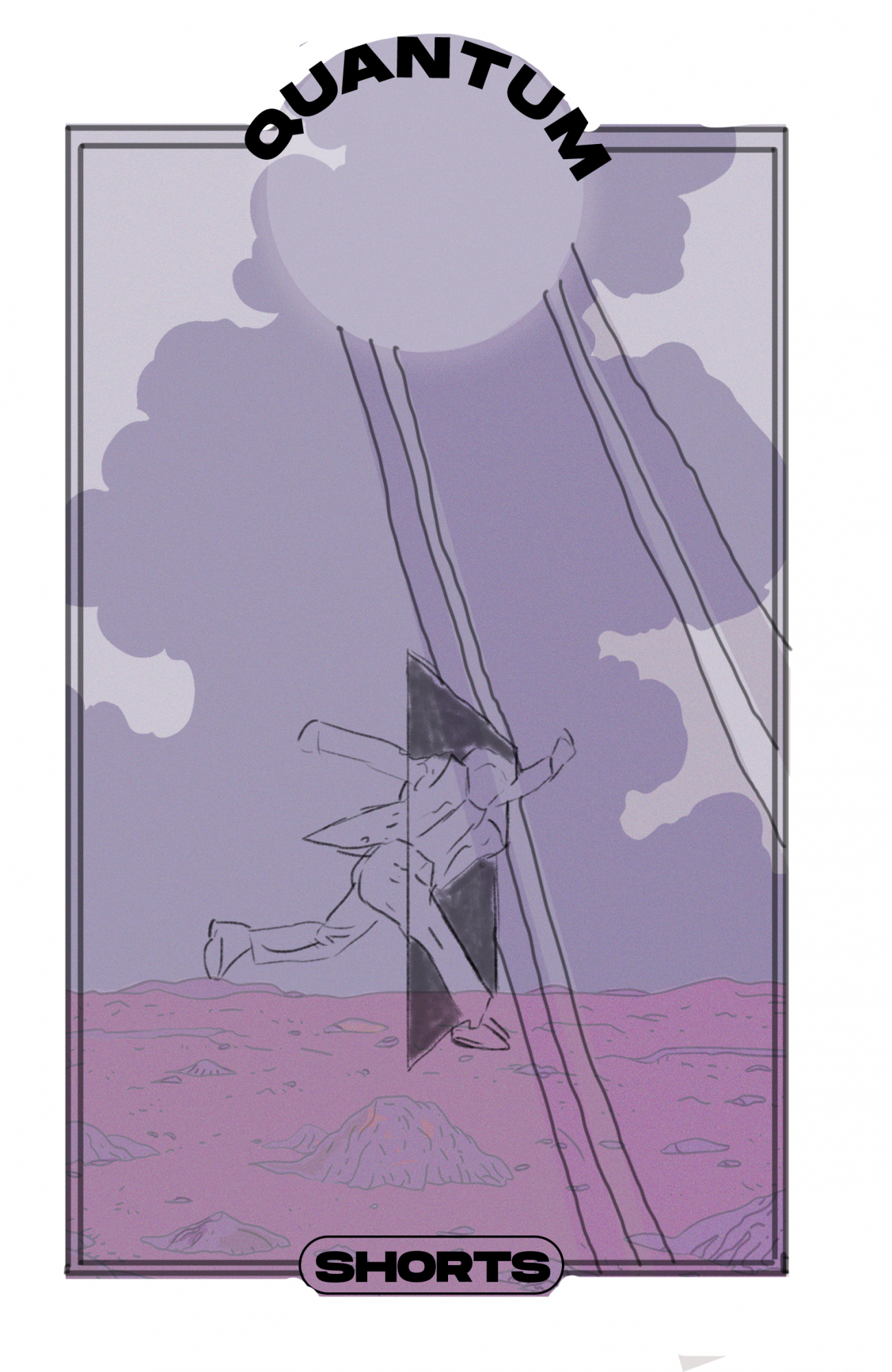
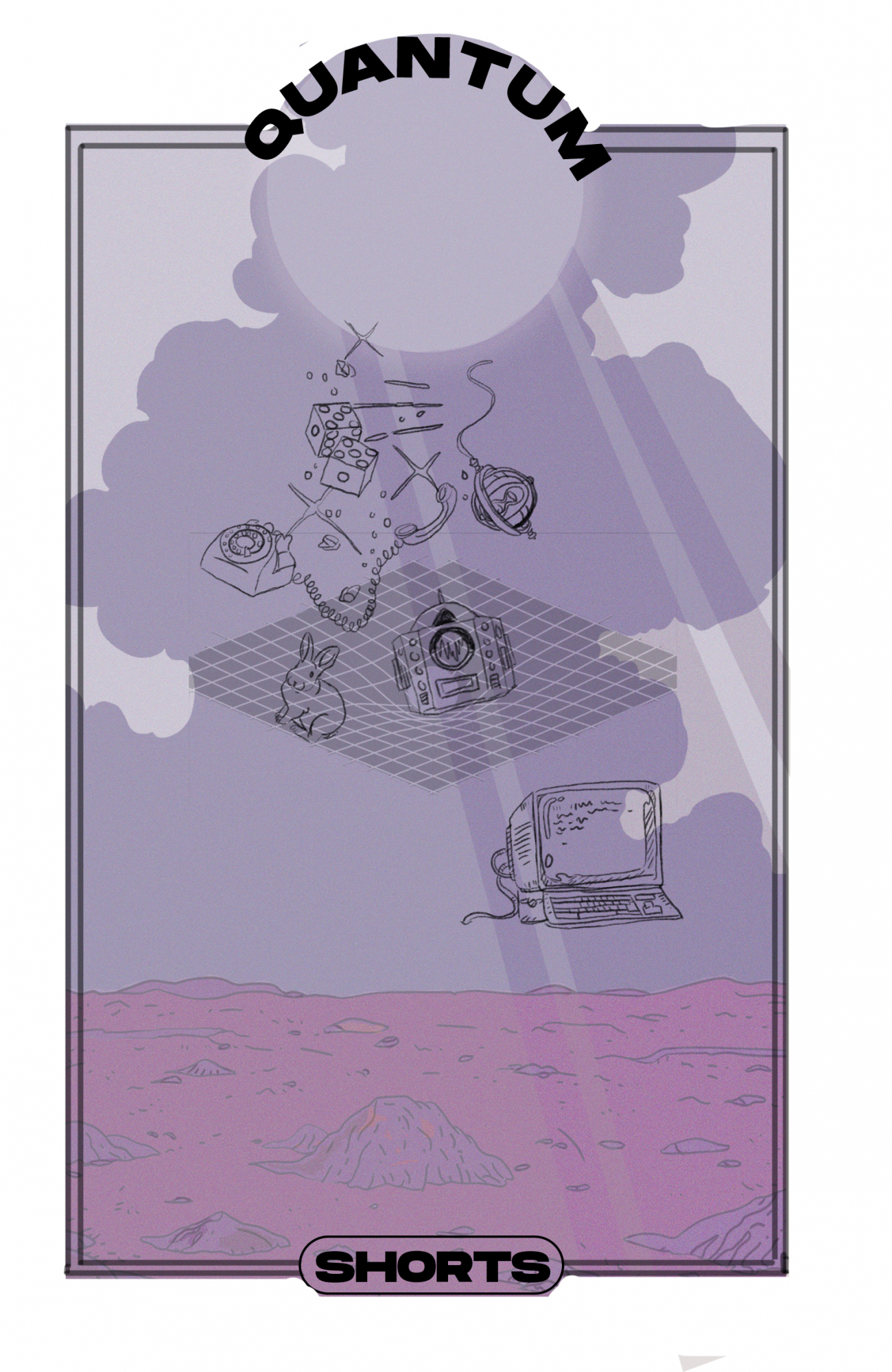
The very first conceptualisations of the Quantum Shorts book cover. Syafiqah’s idea is to take elements from each short story and combine them all in one place. This is to create a fiction world of the book.
What inspired your cover design and what kind of research did you do?
Usually for book cover designs, I find it really important for designers to read the actual content and not just settle for the synopsis at the back. You get a better understanding of what you’re designing for. Then I’d look up different designers/artists/illustrators for inspiration.
Syafiqah used a clean, simple and modern font to give the book a scientific feel. Each story has its own title page and story titles are placed on top as useful signposts in the anthology.
Give us a little insight behind the art of choosing fonts and deciding how a book should be laid out.
In general, you’ll want the typefaces you choose to match the overall feel, essence, context and intention of the book. Readability also plays a part when it comes to designing.
For Quantum Shorts, I used the Agne and Caslon fonts. Both are similar; they look and function well in many different settings. They are modern yet have a timeless quality which makes the designs elegant and classic.
Did you have a favourite story from the collection?
I really enjoyed “There Was A Sun” and “Ana”. The characters in them are very personable and relatable.
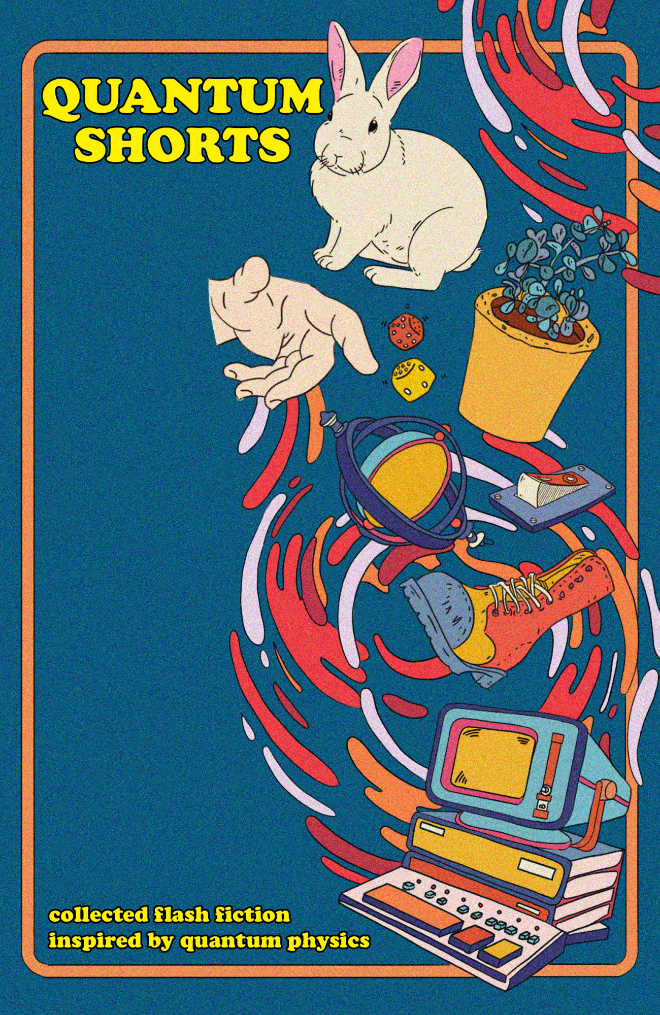
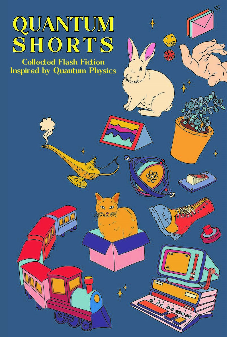
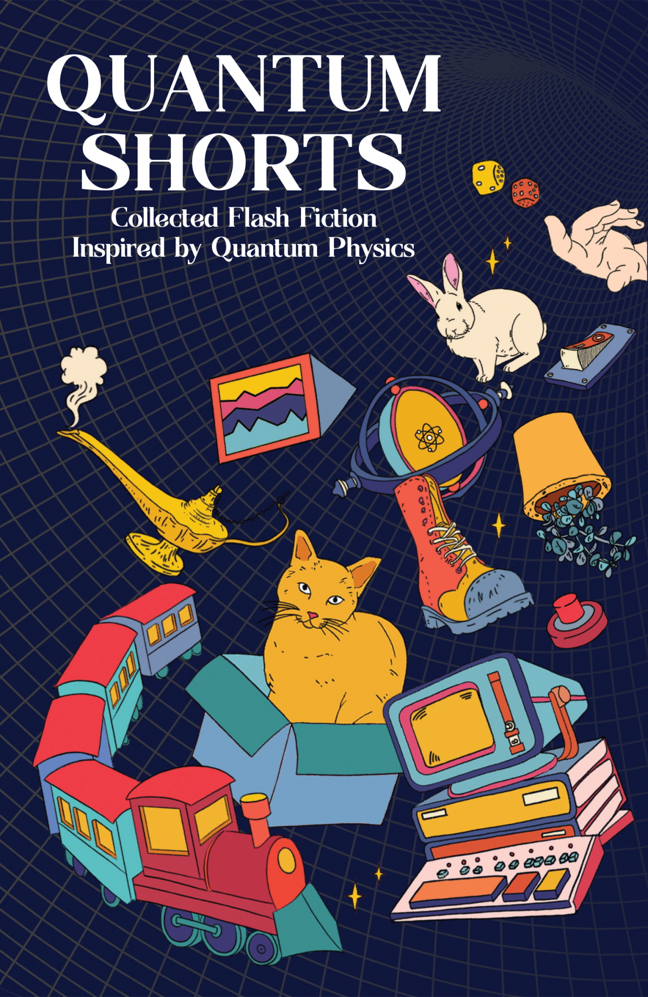
The book cover evolved through a few iterations during the design process before reaching its final form on the right. Syafiqah was inspired by the essence of retro-futuristic surrealism she got from the stories in the book. We liked the cover so much that we enlisted Syafiqah’s help to adapt the graphics for the current Quantum Shorts flash fiction competition!